2017 The unfair grounds
Pre-production
Active VS Passive
In game scenes, it can be active or it can be passive. Active means that the game creator purposely left information out and make different routes throughout the game to make the audience think about a scenario to involve them into a game to make more of a personal feeling to a game. Passive means that the game is given a lot of information like text and facts to help the player understand what is going on in the game, however this information does not involve the player.
Active
- Forming Opinions
- Paying full attention
- Playing a game
- Can change the ending
Passive
- Accepting opinion
- paying little attention
- watching a game
- set unchangeable story
Semiotics
The theory of signs, we use signs such as symbols and colour in video games to show extra meaning. Their are 2 category’s in using symbols which are denotation and connation.
Denotation is the actual thing such as a heart in the human body.
Connation is the emotional response or connection to that image for example heart = love.


Denotation
- Muscle
- Pump
- Blood
- Organ
- Body
Connation
- Love
- Valentine
- Feelings
- Romance
- Sweet
![colour connotations[1]](https://zacharyp4911.wordpress.com/wp-content/uploads/2017/09/colour-connotations1.jpg?w=1000)
Colour Semiotics are useful because it is a simple way to make the gamer feel a certain way.
Alien

We looked at this poster to see how semiotics worked in the film industry.
The technique used is a contrast of colour to highlight the alien. It also gives an effect of discomfort, suffering and smothering because you can see the alien is chocking the person inside the suit. The effect on audience is it is playing on their fear of the unknown. In most films this creates tension. A different way we can look at this is that the alien is saving him because his suit may have broken and the alien is given him oxygen to survive.
Logos

The Final Fantasy was created in 1987 and the company represents a fun and exciting experience full of story and action pack adventure. Their logo represents this by the font of the writing because the writing has very sharp edges which could be shown to be a strong reliable company. The man stance suggests action because it seems that danger is around everywhere. This logo also suggest great quality because the art of the character is well designed and detailed, which suggest that the company has spent time into their franchise. The colors in this logo is blue and black and the blue represents a calm and joyful experience and the black is bold because it wants to be dominant and in your face so the game can attract you. I can implement this into my work logo by added blue to shay my game will be joyful to play.
![]()
The Final Fantasy 15 was created in 2017 and logo has evolved over time however it still have the same writing properly to keep the brand reliable by linking a great game to another. However it has change in the Roman numerals probably to suggest that Final Fantasy was apart of your pass that you know the quality of the game. What has also change is the art style of the characters for example the first game was a man just about to fight but this logo has a woman sleeping this could suggest that Final Fantasy is apart of your family and it is taking care of you. The colours in this logo are basic the same as the first Final fantasy, which shows that the whole franchise is clam, joyful and dominant, however this logo shows hints of red this could suggest that the franchise is evolving over time to suit the target audients but adding the feeling of danger with the colour red yet they are still showing Final Fantasy to be your friend because the red could be seen as the warmth and love of the franchise.I can implement this into my work logo by adding red to represent the danger in my game.
Communicate
I will communicate to my audience using semiotics and color semiotics. The shapes I use will be pixels because it give a retro feel to the game and I will be using colors like reds and blues to show danger and freedom. I will put a horror game across by using lot of sound assonated with horror games like a child scream or a squeaky door. I would like my audience to test my game and give me feedback but I would it to be detailed because “I realize that “good” is extremely subjective. Good could mean highly rated, best-selling, competently made, or even just super cool” (S.rogers level up! 2014)
The start of Freedom and fate
Construct 2
Freedom and fate was intended to be made in Game maker , However we had computer difficulties so we are making the game in Construct 2. I believe this is a good decision because I can learn more gaming software and have a deeper understanding on core game creation. This will also help me because I will learn different art styles, which will help me in the future . All the gifs on my blog are made by me on Piskel.
Logo

This is my Logo for my game because I was trying to add the game feel into the logo. I use color semiotics in my logo to show danger and reward. This is shown by the red which is danger and the blue which is reward. Red represent dangers because red is the colour of blood and bruises. Blue represents reward because it is a calm colour, which is reliving and rewarding in my game. The heart and skull represent love and death also the heart is trying to tell the audience that to love freedom because in the game you have a lack of freedom so it is trying to make the player reach his or her end goal. The skull represents the difficulty of the game and that difficulty is always link to your end goals. Both the heart and the skull are on coins to show fate as example “A flip of a coin” is 50% chance going right and wrong. This also is trying to show the balance of story and horror in my game to make it perfect. The font is bold to make the logo in your face and to show the game is complete and solid.
Target audience
audience profile questionnaire(3)
I have decided to go for a target audience of 12 to 18 because this game will be a physiological horror so it will be less gory and I believe parents will allow 12 year old children play my game. My game is trying to grab indie gamers and horror gamers because I believe my game style will be best for that audiences.
The links above have help me develop my game towards my target audience because I was able to find my perfect audiences and look into their likes and dislikes to finalize my game in being suited for them.
(1). The target audiences link helped me by finding a rough understanding of my target audience so I can start developing my game in my audiences in mind.
(2). Audience Profile link is the advanced target audience. This has helped me by me knowing exactly my target audiences is so my game can be change to suit my market.
(3)The audience profile questionnaire was used to find my target audience and to show that I have done primary research in this project.
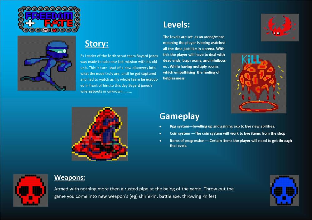
My game is a 2D top down action horror game, which would be made in Game maker and Piskel. The graphics are pixelated because it is quicker to do. My world is set in a apocalyptic environment, which was cause by a nuclear accident, in which only the Node rule, However in hard time survivors like the Outlanders try to reclaim their freedom. Not much is know about Node but one thing is for certain, They are not human. Me and my partner both worked on the one sheet equally.
Core game ideas
You play as Bayard jones who is a skilled scout for outlanders. Bayard was on a top secret mission to discover what Node really are, however he is discovered escaping the Node head quarters and forced to watch his whole team die in front of him. But for some reason Bayard wasn’t killed yet woke up in a dark bloody room with his team’s decaying flesh around him. Bayard can only remember the executions of his team and nothing else due to him getting P.T.S.D from this traumatic experience. Bayard must wander around this maze of dark and disgusting room to reclaim his freedom and deliver top secret information about the Node to the Outlanders.
“Video games foster the mindset that allows creativity to grow.”(Noland Bushnell, 2017)
Character
“Never design your character like a garden were anyone can walk,design your charter like the sky were everyone desire to reach” (unknow, boradofwisdom.com 2015)
Main Protagonist: Bayard Jones


Bayard Jones was an elite Scout for the Outlanders, He was force to do a resonances mission with his old unit to learn the secrets of the Node. Only to see his whole team publicly executed when the mission went south. When making Bayard the first I decided to make a mega man feel as it was easier to do at the time so look up some mega man position to help make Bayard Jones the first. Bayard Jones the Second had an army man feel to him, however I wanted something more futuristic yet I loved his walk but his design is copied of the internet so I decided I need an original character so I made Bayard Jones the Third. Bayard Jones the Third mix the walk style of Bayard the Second and the look of Bayard the First. Bayard Jones the Third is my character for Freedom and fate, However I had conflicting theme so I change Bayard into a knight.
P.T.S.D ( Posttraumatic Stress Disorder )
Posttraumatic stress Disorder, it is one of the most severe and well-known of the psychological trauma out there. It can lead to short-term and/or long-term memory loss. Bayard had seen his whole team killed before him and now he has PTSD because of this traumatic experience he can no longer remember anything apart from the death of his friends. Bayard will experience flash backs to regain his memory like people do in real life. I believe this is a good idea to bring up a serous illness into a game so more people are aware of the illness so they could help other real people with P.T.S.D. An example of this is if you may hear a loud noise and relive combat experiences.(PTSD UK, 2017)
Main Antagonist: The Node


The Node is a secret organization with plans nobody knows apart for themselves. The Node hide in daylight yet imposable to discover, once they where human but now that far from the truth. People known that they try to destroy the resistant’s but they don’t know why. These are some of the monsters that we know so far yet there are many more we face from The Nodes citadel.
What makes an Antagonist?
An Antagonist should meet different criteria depending if they are a boss or a minion.
A Minion should be simple and easier to kill. It should be able to reuse it’s art design like change their colour to show more or less difficulty. Minions should teach the player basic skills of the games or how to kill certain bosses like teaching the player the weak spots of the enemy e.g. the back or the eyes. Minion should be simple yet entertaining because these will be the bulk of the game. They are also used in key game mechanics for example grinding or getting the right items.
A boss should be difficult to kill or oppose more of a challenge, these could include weak spot or certain items to do more damage. The art of the bosses should be more complex and individual. This means a new style for each boss. Bosses should take all of the players skills they have learn throughout the game. This make the game less boring because use are using a range of skill. When you defeat a boss the kill need to be satisfying because it will feel like an achievement to the player. This will make the game more enjoyable for the player. There are three steps to a boss
Step 1 is to make the player understand how to kill it.
Step 2 is making the player do the action to kill the boss with confidence.
Step 3 is making the boss a lot hard to defeat.
Protagonist Organization: The Outlanders
The Outlanders rose from the ash of the apoplectic world only to see the Node steel their land they owned before the accident. The Outlanders mission is to destroy the Node to reclaim their land and their life’s.
Key Elements of my game
My game is a 2D horror game, which is hard to pull off so I plan to focus heavily on audio to make the game scary. My game will have a coin system where you can buy items to progress though the game for example you may need a ladder to get to the next room. We also have mini bosses, which will give you more coins and a fragment of your memory back so at the end of the game you will know the whole story. To keep the game fun I will implement a RPG system where your base stats will increase and set ability’s will be gained. The end goal is to escape the maze and show the world who the Node truly are. The skulls are the coins in my game because they give more of a horror feel to the game and they are different color to show different point value. Coin are needed because (In the beginning, there was scoring, Scott Rogers Level UP ,2014) so a coin scoring system is a basic function I need. 


Level design
I did level design for my game with my partner and we have decided to have one massive level where the player would run around. We are planning to make a design for the rooms and corridors, which would be placed into a set position to make a maze. We have also decided that rooms would be monster spawns and corridors would be mini puzzle game like the floor is falling or the walls are closing in and you must mash a button to avoid falling. We also made a game cycle. This explains the actions you will be doing in the game. The main protagonist is 55 by 45 pixels so the rooms should be much bigger.
The first thing I did was make a rough design on paper (map on paper) then I made the floor tile and my partner made the wall tile for the rooms we are doing. The purple tile is the floor and the gray tile is the wall. Then I made the level with the tiles on Construct 2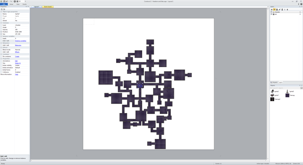


Piskel


This is the shuriken Bayard jones use’s throughout the game. This was very hard because I struggled to make it rotate because of how many pixels I had so I made it look like it was rotating by extending the end of the blades and increasing the speed. I have included a slowed down shuriken to shoe that it is not rotating. I have done all Piskel work on this project unless stated otherwise.
Game Maker
Start screen
 I designed the start screen with the idea of chains ripping apart when the player click any button. I have decided this because the chains show imprisonment and solitude, which is a main theme in my game, However they rip apart when the player click a button. This is trying to show the player that you have to play to escape the game and forcing the player to break the cycle of misery, imprisonment and solitude to win the game. The background flashes red and blue because these are the main colours of are logo. I have decided to implement these colours because of colour semiotics.( Red showing danger) and (Blue showing reward). I research the opening of AOT (Attack on Titan) for inspiration for my start screen because I like the feel of hopelessness in AOT so much so I wanted to transfer it into my own work.

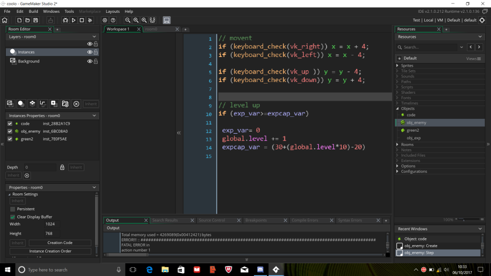
This is the basic moving system and leveling up system in game maker using GML code.
What do the labels mean
The PEGI labels appear on the packaging which shows one of the following age levels : 3,7,12,16 and 18. They provide a reliable indication of the suitability of the game content in terms of protection of minors. The age rating does not take into account the difficulty level or skills required to play a game.
PEGI 12:
PEGI 12 videogames that show violence of a slightly more violent nature towards fantasy character and/or non graphic violence towards human-looking characters or recognizable animals, as well as videogames that show nudity of a slightly more graphic nature would fall in this age category. Any bad language in this category must be mild and fall short of sexual expletives.
PEGI 16:
This rating is applied once the depiction of violence (or sexual activity) reaches a stage that looks the same as would be expected in real life. More extreme bad language, the concept of the use of tobacco and drugs and the depiction of criminal activities can be content of games that are rated 16.
Sound
First song: Resonance from soul eater played by Animenz
Second song: Sadness and sorrow for Naruto played by David Erick Ramos
Melody- The tune of the music
Harmony- The chords and chord progression
Rhythm- The beat and groove of the song
Structure- The different sections in the song
Texture- The number of layers of music going on
Dynamics- The ebb and flow/ musical arch of the song
First Song Melody:
The tune of the music is very fast pace because this is an example of the type of music I would like for boss battles.
First song Harmony:
The progression of the Harmony is rapid to give a pules raising feeling to the song
First song Rhythm:
The rhythm is fast beat to make the music exciting
First song Structure:
The structure for the song star off slower then after a couple of seconds amps up the speed.
First song Texture:
The song is one layered son because their is only the piano playing
First song Dynamics:
The flow of this song is slow, fast, slow, fast this make the fast sections more dramatic
Second song Melody:
The melody is very slow and peaceful because this is the song in which a character is killed
Second song Harmony:
The progression of the Harmony is slow and relaxing to show sadness
Second song Rhythm:
The rhythm is slow to make the music more emotional
Second song Structure:
The structure of this song is slow throughout the song
Second song Texture:
The song has 2 layers a Ocarina and Acoustic guitar to make the music full.
Second song Dynamics:
The flow is so slow and peaceful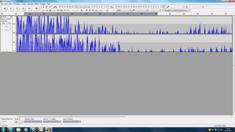
This is where I used auidacy to make sounds for the game. This is one of the mini bosses voices. This was difficult because at the start I didn’t know how to use Auidacy and this sound was not scary, however thanks to my teacher I was able to understand Auidacy a lot easier and made this sound scary.
Plat former
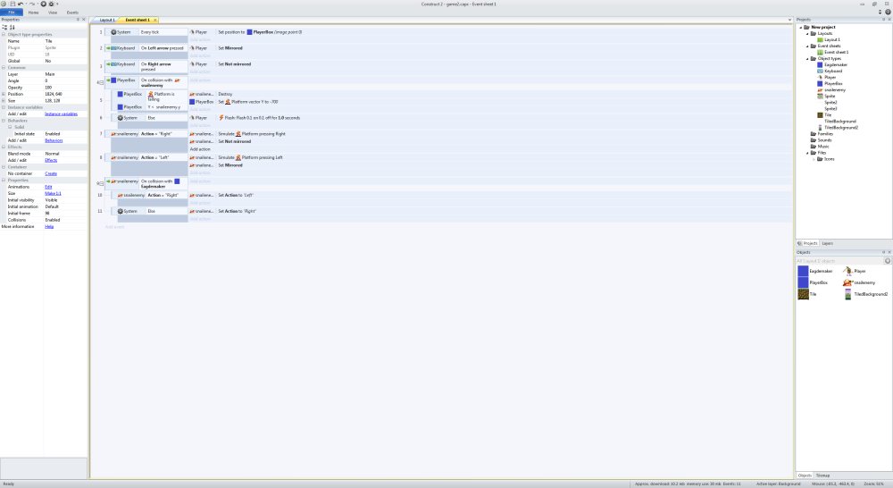
I made a platformer in Construct 2 to familiarized myself with the program. I was able to make my character animate and kill enemy’s. My enemy can move on the platform. here is the code up top.
I found this very helpful because I am more knowledgeable with Construct 2.
Evaluation/Production diary
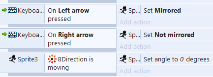
I started with the very basic of game creation movement. When I started I put this in.
However there was a problem every time you turned the player character it would flip on its head. Then I decided to set its angle to 0 when he moves. This worked because it set the angle in front all the time. Next time I make a game in Construct two I will do this and save time.
Then I decided to make the player attack by adding throwing daggers which went multidirectional so I came up with this.

I decided to use the W,A,S,D keys to throw the daggers because of human ergonomics( Ergonomics: The study of people’s efficiency in their working environment ) which make it easer to control the player. However I discovered a problem with the daggers only throwing in one direction so I set the angle of all 4 dagger directions.
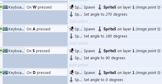
Thanks to setting the angle the daggers I was able to make the daggers work. Now I know this I able to code player projectiles in my game.
The next problem I had was the boss and player death screen what happed is the explosion would stay on the screen.
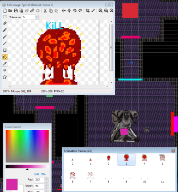
Then I figured out that I didn’t want the animation to repeat and I need a black screen at the end to make it repeat. Thanks to this I know how to death animations in to my game.
I was thinking how would the game progress in difficulty so I decided to spawn monsters depending of the movement behavior’s of the player. This meant the player would have a different experience every time. I started by putting in collision boxes in corridors so when the player touch these they would spawn 3 monsters in each rooms.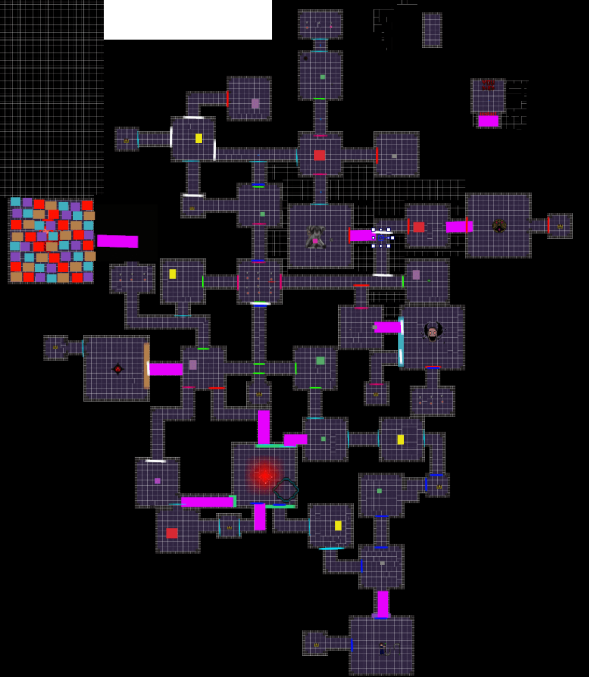
Here is the code
This worked great, but when it came to play testing the difficulty was too hard so I turned down the spawn rate from 3 per room to 1 per room. I did this by deleting spawn boxes. I now know how to randomize enemy spawn due to the players play styles and behaviors.
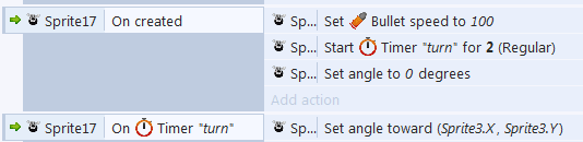
In my game I had a ghost called Bob and I wanted the ghost to following the player but not all of the time so I used the timer command to make the ghost turn to the players position every 2 seconds this made the ghost attack fun and interesting. This has helped me know how to use the timer behavior for this project and others to come.
When I started I struggled with image points however fuzzy face boss helped me because I needed to learn and over time practicing I was able to pick it up.
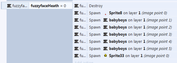
Thanks to this I know image point and I can implement this into my game and in the next game.
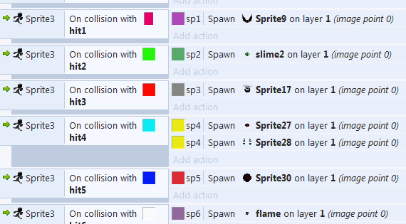
I had a massive glitch where all monsters warped thought walls and attack the player , however I have fixed that where if the monsters, coins etc. warped out of walls it would be destroyed. This has made my game more playable and enjoyable.
Unit 2/ Research

Animation Research :
The pre-digital Animator I will been looking at is, who is the creator of humorous phases of funny faces. I will be covering the influences , major themes, character choices and historical context to see how humorous phases of funny faces developed. “The optimist thinks this is the best of all possible worlds. The pessimist fears it is true.” (James Stuart Blackton,2017)
Influences:
J. Stuart Blackton Was the grandfather of stock motion animation and he was an influences to every stock motion like Disney and Pixar.
Major theme:
The major theme of humorous phases of funny faces is showing stock motion animation to the public. It also shows wealth at the time because of men with top hats and high class suits shows a more civilized society. It also shows how woman is poorly treated by smoke blown into her face.
Character Choices:
Their are many character in this stock motion animation like high and middle class men, which shows that a mans social standing didn’t matter. There was a clown to entertain the audience because at the time a clown was entertaining.
Historical Context:
This animation was made in 1906 and left a massive mark because James Stuart Blackton was the godfather and pioneer of stock motion animation and lead this animation as the leader and founder. His work help people create animation like Steamboat Willy.
My post-digital Animation is The Walt Disney Company founded by Walt Disney and Roy O Disney. I will be talking about influences , major themes, character choices and historical context.
Influences:
They where Heavily influence with Steamboat Willie and his art style. Characters like Mickey mouse was made around the old style of animation.
Major theme:
Disney major theme is peeling to children. They do this by have round shape and bright colours most Disney film try to send a deeper meaning e.g. a morale.
Character Choices:
Disney have many characters like Mickey mouse and Donald duck. Both of these characters are very round and colorful, Which make their characters more inviting for children.
Historical Context:
Disney have deep history with Steamboat Willie, which has made the company what it is. The art is basic the same. Disney has entertain for a lot time and it know its audience.
Emily Mulenga
Emily Mulenga is a student who is trying “to explore ideas of the body, the self, race and sexuality”(Mulenga,2017). She was born in 1991.

This is some of Mulenga work. This is called MRS, Ticking time bomb because it is trying to show that emotion can explode. She is also trying to show that woman find it harder to handle emotion and we need to think more of woman.
The first thing I notice is that she over sexualizes all of her characters properly to tell are audiences that we are over sexualize woman in modern day life.
Her target audiences is young black females.
The message she is trying to communicate is that we over sexualize black women and we need to stop, however she does not do this successfully because she is explaining that you can’t do this by doing it therefore hypocritical and irrelevant.
Emily communicate by using black woman stereotype to the extreme to show how people portray black woman in the society.
I have learn that I need a wide range source’s from “art” museums, books and online.
I can use the 3D design in my work for the future also what Mulenga actually did well on was having her target audience in mind so I can show this in my work by looking at trends for horror games and implementing them into my game. Gender neutral
Flash//( Ha-ha He can save everyone)

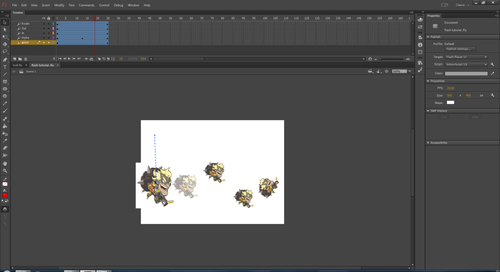
In Flash I had to do basic animation using graphic, buttons and tweens. The top one (ball) is an animation where the ball would bounce when I click the bounce button. The ball would curve then squish when the ball hit the ground and rebound upwards. This took time because I have to learn the properties of the button symbol however it has turn out great. I now know how to use graphic and button symbols.
The bottom one (junkrats) was used to learn tweens. In this I made junkrat rotate, move, invisible and expand. This help me learn the basic of Flash. These include adding images to Flash and the basic of animation.
In my game there were conflicting themes of futuristic and medieval so I decided to go medieval because I had more sprites with the medieval themes, however Bayard (The player) had a futuristic theme so I turned to armorer based in the medieval period.
Most knight helmet’s have the Christian cross on the helmet so I gave it to the player character also I made the player gray and black because I wanted to give the player the fill of rustic armor.


Quantitative
Qualitative
I have had long talks to my partner ( Jonathan Turner) which is a form of Quantitative research because we made the game in mind of both of are options.
Primary
The primary research I have done is made questions airs to see my target audience and I have also talk within a group to see what to do with this game.
Secondary
I have done lots of secondary research like knight helmets, Logo, semiotics, character design and code.
Horror Trends
After looking at the link above I have discovered that Horror trends change over time like in Friday the 13th was based when “slasher” movies was popular, However now psychological Horrors like MAMA and Donnie darko are trending and this is why my game character is alone and unknown creatures are trying to kill him.
Summing up my research
- What research did I do?
- How did my research influence my game?
- Which research was most relevant?
I did a lot of primary and secondary research. I can prove this with the mutable questionnaires I did in my target audience. I look at their age, gender and what games they like to play. The secondary research I have done has been looking up horror trends, finding medieval armor designs, looking up the origins of animation, explaining semiotics, finding designs of an open screen, looking at music to influence the emotions of the players and going to art gallery’s likes Mulengas.
All of my research has help my slow develop my game. The questionnaires suggested a dark colour pallet to make it a horror game
Play test
My game got play tested with my class group and I had them write down some problems with my game. These includes that the difficulty of the game was too difficult, it was hard to find item you could buy and their was a glitch which warped you thought the wall. After knowing these results I turn down the difficulty by spawning only 1 monster per room instead of 3. I also added more purchasable items in easier locations to find and I fixed the glitch in which monsters and rarely the player would warp thought the wall by making it where anything apart from the ghosts would die if they warp out of the map. The only reason why the ghost can pass though is because they are ghost and hold no physical form (game manic).
Unit 3
Industry Know-How
Task 1
http://creativeskillset.org/search?q=game
https://www.gamesjobsdirect.com/
Task 2
I plan to be a Game designer because
A game designer has do a bit of everything. Game art, Programming, marketing etc.
I like to develop/make the story of a game because I like that side of game making.
I want to be a team leader because I would need to organize all different groups of staff which is making the game.
Task 3
Interactive portfolio
Task 1
layout should be neat and adapt to every screen to make your portfolio flow.
Typography is the what the writing look like. These included size and shape.
Colour should not be harsh like green and red because it may give the user a headache.
Graphics have visual impact and communicate with the user. Graphics could switch out words with gifs to make it interesting.
User experience
Activity
What work
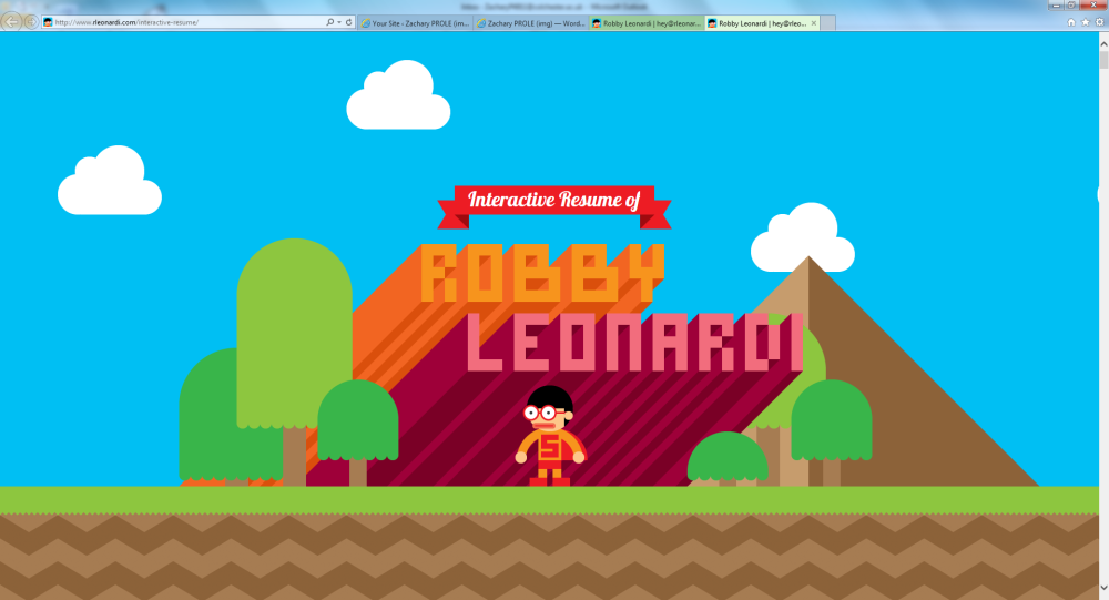
This portfolio is extremely creative and a brilliant way to get into the creative industry such as graphic designer. Robby also uses chart to show his skills which is great way to cut long paragraph and show skill.
What doesn’t work
His portfolio is great however it is too long. It would be much better if it was it had the same information but shorter.
communication with audience
It is very colorful which is good because it attracts you to his port
user experience
